Tuesday, November 20, 2012

Video Review - Mod. 13/14


1. For each video list/discuss the key concepts you learned.

An Acquiring Mind:
The first hurdle of getting an artwork into The Met is presenting it to the director of the museum.  Philippe wants quality, and always attempts to remain objective and keep his personal tastes out of his decisions.  Identifying outstanding works to go to the director of The Met is the job of over 100 curators and assistants.  Requests for purchase must first go through “The Dry Run” in which the person proposing the piece has 5 minutes to sell it to the Director before it goes to the Board of Trustees.  The Met has numerous conservators that are experts in their perspective fields and are able to re-create ancient and modern techniques in works that need restoration.  Some conservators even use x-rays to examine the objects in need of restoration.  Many of the artworks become even more stunning and beautiful when the history and restoration of them are revealed.
      
Native American Archaeology:
Archaeologists all over American have been studying Native American remains for years.  Countless remains can be found in museums across the country, with individuals using them to find out more about the human race.  However, some individuals find this to be disturbing and disrespectful.  Many Native Americans believe that the archaeologists are tainting the sacred burial grounds and remains of their people.  They do not view it as helping science; they view it as harming their ancestors.  Laws have been put into place that these remains must be returned to the Native Americans, stopping archaeologists from continuing their research.    

Displaying Modern Art:
Tate Modern created a new way of displaying modern art, and is now characteristic of modern art museums.  The art was categorized by art movement, and shown in chronological order so that the public could see how one movement flowed into the next and inspired similarities and differences.  Artists quickly began to push the boundaries of this categorization, so the way in which art was displayed needed to change.  The art was displayed in 4 sections, a thematic approach: landscape, still-life, history, and the nude.  These themes transformed even further becoming Landscape/Matter/Environment, Still Life/ Object/ Real Life, History/ Memory/ Society, and Nude/ Action/ Body.  Some critics were displeased however, by the abrupt transitions from room to room in the museum.        

West Coast Pop Art:
Lowbrow is usually in reference to an artist with no taste.  However, Lowbrow artists look at themselves as being for the people, having heart, being rebellious, and having balls.  People can actually recognize the imagery they’re seeing because it references pop culture, car culture, and folk art.  Art galleries are usually unwilling to display this type of art, but Laguna Art Museum was the first to showcase these artists in a culture show.  It took some time, but eventually female artists began being introduced into the Lowbrow culture.  Punk rock culture really embraced Lowbrow because many of the bands wanted to have Lowbrow artworks on their album covers.  Lowbrow is becoming increasingly popular around the world.            


2. Do the videos relate to the creation of your Art Exhibition project? If yes, explain how. If no, explain why not. 

Two out of the four videos pertain to our Art Exhibition project.  An Acquiring mind relates to this project as it reviews how artworks in The Met have been displayed over the years.  It also explains the process that an artwork must go through, and how many curators it must be approved by, to be worthy of display in The Met.  The Displaying Modern Art video also pertains to our project as it discusses different methods of categorizing and displaying art.  Both of these videos allow us to understand what goes into setting up an exhibit.  The Bones of Contention video is more of a history of what has happened to Native American remains in archaeology.  The Lowbrow video is also more of a history and description of the Lowbrow art culture.  These videos do not have much to do with curating an art exhibit, but they do give us insight into different forms of art.

3. What is your opinion of the films? Do they add depth to understanding of the art concepts you practiced while creating your curation project?

I believe that these films will help me in creating my art curation project.  I have now been introduced to the curation process as well as to different methods of categorizing and displaying art.  I believe that these videos will help me to look for specific aspects of art when I am creating my exhibit.  
Friday, November 16, 2012

Module 12 Video Review


1.  I chose to view the Andy Warhol video because I have always been amused and fascinated by his artwork and zany personality.  I wanted to explore his work more and learn about him as an artist a bit more, so I decided to watch the video.  I chose to watch the Sculpture of Spaces video because I was intrigued by the idea of using the earth as one’s canvas.  I wanted to see these works and see how they were created, so I chose to watch this video. 

2.  Andy Warhol would recreate famous images of famous people such as Marilyn Monroe or Elizabeth Taylor or Campbell’s Soup.  Warhol would destroy the original image by reproducing it and making it even more superficial.  Warhol moved into an apartment with tin-foil covered walls that came to be used as his studio as well as a hangout for artist parties.  He turned to photography and became obsessed with celebrity and making people famous.  He published his own magazine and made a movie with Elizabeth Taylor.  He returned to making silkscreen paintings and people would pay him money to be the subject of one of his paintings in order to become famous.  Warhol also became a journalist in his later years.
Isamu Noguchi walked away from sculpture and went to Japan where his idea was formed and inspired.  He wished to create works in spaces where people could meet and come together to enjoy them.  Noguchi began to create sculpture gardens in New York that were inspired by his childhood in Japan and the intricate gardens found there.  Noguchi was commissioned to re-design Miami’s Bayfront Park, but was faced with adversity by city officials who did not wish to fund his vision and unique style of sculpting.  Nevertheless, Noguchi won out and the park was created in his vision.  He went on to explore other mediums for his parks, including slides and water, and began to include these features in his designs.  One specific work that he created that was very important was his sculptural work in Jerusalem which were acclaimed for their sensitivity to the religion and natural features of the area.  It was said that Noguchi visited Jerusalem and just completely understood its importance and relevance and beauty, and created something that fit perfectly with that image.          

3.  The video on Andy Warhol relates to the book because there was an artist’s profile page about him in the book, as well as several of his works.  Where the book only touches on the work of Warhol, and focuses more on his personality, this video focuses more on his work.  The video goes more in depth and surveys the life-work of this famous, celebrity artist.  The Sculpture of Spaces video also relates to earlier readings in the text where we read about earthworks.  The video is similar to the Warhol video in that it goes more into depth and focuses on one particular earthwork artist and his work.  In this video we get a thorough look into the life and work of artist Isamu Noguchi.    

4.  I believe that watching these videos is important because it allows us to learn more about the world around us, as well as about specific artists, artworks, and art styles.  It adds depth to our knowledge of art, but also to our knowledge of life in general.  The videos open our eyes to history and various cultures and customs and ways of life that we may not have learned about otherwise. 

Sunday, November 11, 2012

Art Gallery Visit # 2


Definition of the Gallery Space and Exhibit:

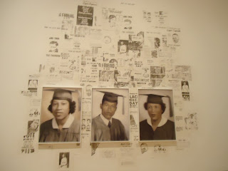
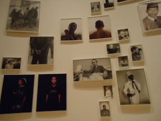
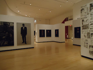
The title of the exhibition that I visited at the Burchfield Penney Art Center was McCallum Tarry: Intersections.  The works in this exhibit were created by a husband and wife team named Bradley McCallum and Jacqueline Tarry.  The theme of this exhibition is a mixture of a few different subjects.  The Civil Rights movement of the United States, homeless youths in America, mothers with their children, and public use of public space are all included in this mixture.  The exhibit is bathed in a warm, yet bright light.  All of the light in this space comes from natural light coming in through high windows, and light fixtures planted in the ceiling.  The exhibit is rather large, so there were several different colors used on the walls.  Stark white, deep crimson, and wallpaper were used.  The wallpaper was composed of hues of silver, gold, crimson velvet, and peach.  The gallery itself has many different nooks and crannies.  However, the space, in general, is fairly circular in shape and one may walk through each room /exhibit of the gallery by following that circular pattern.  There is also a second gallery space on the second floor of the gallery that may be accessed by stairs found in the main gallery space.  The architecture of the gallery space is very interesting.  There are many free-standing blocks of walls that are used to house the artworks, along with the normal walls that frame the space. 
The artworks of the McCallum Tarry exhibition are organized in groups, as the exhibition is broken up into mini-exhibitions.  The pictures and paintings are clustered, some in triangular shapes, some rectangular.  They seem to be grouped by meaning, such as portraits of civil rights activists, images from the civil rights movement, images of the homeless, etc.  Many of the artworks are similar, as they are behind a silk-screen to create a blurry sort of view.  Also, many are in black and white, or are portraits of famous or everyday people.  Some of the artworks are oil on canvas, some are photographs on canvas, some are portraits, some are plaques, and some are video documentations.  Some of the artworks do not have frames.  Others have a mixture of oval, square, and rectangular shapes.  Some look rustic and beaten up while others look brand new.  Most of the artworks themselves are located a few inches from each other.  However, the varying mini-exhibitions within the exhibition are separated by walls, or by a few yards.  The labeling of the exhibit was somewhat confusing.  There was only one label for a series of paintings or portraits, and it was difficult to find where one mini-exhibit left off and another began.  I would have much preferred each mini-exhibit within the exhibit to be clearly designated and marked. 


Art Criticism:

Image One:


Describe:  The image we see here is one of a funeral.  It is not just any funeral, but a funeral for a KKK member.  The casket is covered in flowers, and surrounded on both sides by individuals in traditional KKK garb (whit hooded cloaks).  Five unmasked individuals acting as pallbearers, a young man in a tuxedo, and a priest walk toward the viewer.       

Analyze: This image is balanced symmetrically, as the focal point of the casket and priest are surrounded on either side by members of the KKK.  Shape can be found in the forms of the people present, the flowers, casket, and mausoleum.  Space can be seen between the living and the deceased; the priest and young man, and the casket and pallbearers.  Repetition can be seen in the numerous cloaked figures and an emphasis is placed on those not cloaked.    

Bracket: Religious iconography can be seen in this picture with the priest’s robes and bible. 

Interpret:  There are two different ways in which a viewer might interpret this work of art.  When viewed in context, looking at the theme of the exhibit as a whole, the viewer may believe that it was created to showcase the terrors and horrors associated with the fight for Civil Rights.  Specifically, the KKK and the atrocities they committed against African-Americans and their supporters.  Placed with the other artworks, collectively, we view this piece as part of a greater whole, a piece of the history and events of the time.  Singly, if this picture were viewed alone, one may wonder, as I did, at the humanity of the work.  How could a group so inhumane attend a service that is such an integral part of humanity; and with a priest, no less!  This viewer may believe that the artist was attempting to convey that even though the KKK committed atrocities, they are still human beings who hold their own beliefs.   

Image Two:


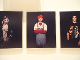
Describe: The images we see here are of 3 homeless youths from Seattle.  The first youth is female and has a Gothic/punk style of clothing, makeup, and piercings.  She stands with her hands in the pockets of her hoodie.  The second youth is dressed in a turtle neck, long sleeve shirt, overalls, red bandanna  and has gauges in his ears.  He stands in a defensive posture, arms crossed across his chest.  The third youth is dressed in black pants, a Bob Marley tee-shirt, necklace, and watch.  He stands in a relaxed pose, one hand in his pocket and one on his side.    

Analyze: Emphasis is the main principle found in this work of art.  In each photograph, a person stands alone in a background of darkness; there is nothing to take away from the image of that individual.  Color and light are also elements that can be seen in these photographs.  The individuals are bathed in light (a contrast with the black background) and their clothes, hair, and skin tones present various different colors in the work.  Form can be seen in the individuals’ bodies, as texture can be seen in their hair, skin, and clothes. 

Bracket: Iconography can be found in the image of musician Bob Marley, the red bandana that suggests gang relations, and the symbol for anarchy and the all-seeing-eye on the girl’s tee-shirt. 

Interpret: Endurance, the name of this mini-exhibit features 26 homeless youths who have lost someone close to them from living on the streets.  The individuals were photographed, gave an audio testimony, and stood still in front of a video camera for an hour each.  I believe that these individuals were photographed in a shadowy, dark background to show the oppression that they face, and the impending trials they will face with a life on the streets.  However, I believe that each were photographed singly, with nothing else behind them in the picture, to give them a voice and a presence; to allow them to be invisible no longer. 

Image Three:


Describe: The image we see here is one of chaos.  Police in riot gear shove through a large group of civilians, gathered for some sort of protest.  A fence separates the police from the civilians, but is opened with police streaming into the crowd.  A few bystanders take photographs of the scene in front of them.

Analyze: In this work of art, line can be seen in the form of the fence, the symbolic separation of good and evil.  Form is also very prevalent in this work; it can be found in the shapes of the people – their helmets and face shields especially.  Repetition and rhythm can be seen in the masses of people and their suggested movement. 

Bracket: Iconography can be found in the Police officer’s badges and riot helmets, and the fence that separates the “good” from the “bad” (whichever that is). 

Interpret: This image was a part of a mini-exhibit which showed the effects of the Civil Rights movement in Japan.  I believe that this picture was meant to show the audience that oppression can happen anywhere, and to all races.  It was also used to show the chaotic element of protest and the fight for civil rights. 

Summary:

I enjoyed going to the art gallery to explore the space and layout and architecture rather than simply the artworks.  It was interesting to look at the use of space and realize why things might be placed in a certain way, or why extra elements (such as extra walls) might have been added. Looking at the space as a whole opened my eyes to how artists, especially installation artists, may wish to utilize specific elements of the space in their works of art.      

Saturday, November 10, 2012

Module 11 Video Review


1. Explain why you selected each of the TWO videos you choose from the selection listed above.

I selected the Dada and Surrealism video because I was intrigued by these movements while reading about them in our textbook.  I found it interesting that both were off-the-beaten-path and looked at the world in extremely unique, controversial, and/or even silly ways.  I also chose the watch the Sunday on La Grande Jatte video.  I chose to watch this video because I grew up with a copy/print of this picture in my basement as a child, and was interested in learning more about it.

2. For each video list/discuss the key concepts you learned.

Dada, the anti-everything art movement, surprised society and took it by storm.  Each artwork was made with some sort of political message or idea of protest behind it.  For example, Dadaist Hannah Hoch’s chaotic Cut with the Kitchen Knife tells a history of parts of the War (WWI).  Political satirist and artist George Grosz moved away from the Dadaist movement, but still created rebellious works.  His works took all of the life out of a scene, and focused on how life had become much more mechanical, by creating machine-like humans and settings.  Out of the Dada movement came a new movement called Surrealism.  John Miro’s beliefs about Surrealism included the idea that pictures are quite different from the world itself, and oppose this world with patterns organized in its own terms.  Pictures should go beyond recording to questioning or criticism.     

A Sunday on La Grande Jatte was created with thousands of meticulous, tiny dots of color.  Many people say that it doesn’t make sense proportionally, ideally, spatially, etc.  We still have no idea what this work is exactly about today…so why do people love it so?  Apparently, the Grande Jatte island was full of prostitutes in real life during the time of the painting, and one of the women in this painting is cast as a prostitute because she is fishing, which is symbolic of sinning.  The most interesting part of the piece for most people is the monkey on the leash.  However, this too was a symbolism of prostitution during the time.  It is intriguing to know that the monkey was not added until a later time, after the painting was finished, and one wonders whether this was because of its connotation.  Seurat studied color theory intensely while creating this masterpiece.  He used his knowledge of colors to develop the style of Pointillism, where he’d place small dots of varying colors side by side so they would vibrate in the eye and create an intense illuminocity.  Along with this theory, we find a young girl in the center of the painting who is dressed in stark white, and is the only figure in the painting without dots and who is looking straight at the viewer.  Today, La Grande Jatte is very important and often used in pop culture.

3. How do the videos relate to the readings in the text?

The Dada and Surrealism video was fairly close to the text in describing why the movements developed and what they consisted of.  However, the video dug a little deeper than the readings and surveyed particular artists in depth.  The same occurred with La Grande Jatte.  La Grand Jatte was discussed in the text, but the video explored every aspect of the work and its creator.  Instead of just an overview, the video answered any question you could have about this particular painting, and taught the viewer about history as well as art.      

4. What is your opinion of the films? How do they add depth to understanding of the readings and art concepts?

I enjoy watching these films for class because I find that the material I learn from the videos comes up in other conversations.  It gives college students something to think and talk about that is different from the norm.  I also enjoy how with many of these videos, I also get to learn what was happening in history during the times that specific works were created, that affected the artist’s point of view and message.  These videos don’t just add depth and understanding to the text and art concepts, but to knowledge of life in general.

Saturday, November 3, 2012

Masquerade of the Dead


I selected this Bolivian Diablo mask as inspiration for my 3-D mask because I loved all of the colors and sculpting effects of the work.  I also thought that the mask was creepy and devil-esque, but had a clownish look to it as well.
Description:  This Bolivian Diablo mask depicts a distorted animal, possibly a goat as it is a symbol of the devil, decorated in bright, violent colors, jewels, and patterns.  Another animal appears to be popping out of the goat-like creature’s head, and his tail seems to be doubling as the goat’s nose.  The goat has rotting, sharp, pointed teeth that are jagged, falling out, and angular.  The horns are especially prominent and emphasized on this mask.  The mask is ablaze in color and ornamentation, and although it is meant to be scary, it also has a circus/clown-like feel.    
Analysis:  The Bolivian Diablo mask is abundant in rich, bright, off-the-beaten-path colors.  Color is a main element of this mask as the vibrant yellows and red-oranges draw the eye to the focal point of the animal’s horns and ears.  The element of line is utilized as well to draw the eye upward and outward through the inner ear and upward through the horns.  Texture can be seen in the teeth of the animal, the curve of its features, and the jewels on the mask.  Form and shape are also prevalent in the animal’s features; the curving nose, mouth, eyes, horns, and the second animal’s body.  There is a great emphasis on the animal’s face and horns, and the entire mask is symmetrically balanced.  Rhythm and variety are also used to create movement through the piece with the elements of color, line, texture, and shape working together.  
  

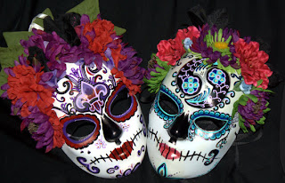
I selected these Mexican Día de los Muertos masks as inspiration because I have always found them to be hauntingly beautiful.  It has always fascinated me that these masks are made to look beautiful and colorful, even though they are meant to represent skulls of the dead.  I also enjoyed the use of color and texture in these masks as well.
Description:  Día de los Muertos, or Day of the Dead, masks are meant to represent skulls.  Their pale backgrounds contrast nicely with the darkness of the eyes, nose, and mouth.  These masks are highly ornamented with color, design, pattern, and at times, bejeweled.  Flowers, especially marigolds, are an extremely important part of the mask, because these flowers are used as offerings to the spirits of the dead, and used to guide the spirits home.  Therefore, the crown of flowers surrounding the mask is typical of a traditional Day of the Dead mask.
Analysis:  Color is a very important element of Mexican culture, which can be seen on these Mexican Day of the Dead masks.  The colors of these masks come in contrast, as the base of each mask is white to symbolize the skull, and the eyes, nose, and teeth are black to symbolize hollowness.  As this base is rather monochromatic, the rich colors on the surface really pop and stand out.  Texture plays a role in these masks in the form of the traditional flower crown that surrounds the top of the mask.  Both masks are symmetrically balanced and unified.  The element of line plays a role in the form of the mouth, and the curves around the eyes and on the foreheads.  There is an emphasis on the foreheads of the mask, as this is the focal point and the area with the most design and color.  Rhythm and variety provide movement around the face of the mask.       


I selected this Masquerade mask as inspiration because as a little girl I had a ceramic Masquerade mask of my own displayed in my room.  I have always found the rich colors and glitter and patterns of these masks to be gorgeous, and I love the pomp and circumstance, and the element of the unknown that surrounds them.
Description:  This particular Masquerade mask looks like something out of a fairy tale; similar to something you would find in Cinderella.  The mask is, like the others, highly ornamented with glitter, rich color, jewels, flowers, and feathers.  The shape and bend of the mask lends itself to the image of a bird, perhaps a peacock.  The entire mask is made out of hues of purple, accented with a small amount of white, black, and silver.  The mask looks regal, elegant, and exceedingly feminine.  The swirls and twirls of the glitter add to the masks sense of whimsy.
Analysis:  In my opinion, color is the most emphasized element of this piece.  The color palette is based mostly around different hues of the color purple, but is accented with black, white, and silver.  The colors are so saturated and opulent.  Texture is also an important element of this mask, as the feathers and jewels, and glitter all provide different feelings.  Line can be found in this piece as well in the swirly lines of glitter, and the center line of the main feather which brings the eye upward.  There is unity and repetition of design in this asymmetrically balanced piece.     


These are my first quick sketches for creating my mask.  I could not decide between a Dia de los Muertos mask, or a Masquerade mask.  The mask material that I had was a plastic Jason, from Friday the 13th, mask.  Whoops.  Anyway, my challenge was: How to make Jason pretty?  I decided to go with my second design, and began the process of cutting the bottom half of the mask off.  Bad Choice.  The plastic just did NOT want to be cut my way, but alas, I prevailed.  I quickly realized that tacky glue was not going to glue all of my materials down, and had to improvise a bit with my design and change it up.  I truly enjoyed making this mask!  I'm not an art major, but am crafty, so I love these hands-on projects.
The materials I used were lace, fake flowers, tacky glue, acrylic glitter paint, ribbon, fake pearl, and sequin.  The main element used in my design was asymmetrical balance.  I piled lace and pearls and flowers on one side of the mask, and left the other slightly bare.  This made the piece look unified and rhythmic.  I utilized the elements of color and light by including light tones such as white, silver, gold, soft pink/peach, and pearl, and glitter/sequins to reflect the light nicely.  Texture was also a big part of my design as I included flowers, lace, sequin, plastic, and glitter.  Finally, I chose to emphasize the right side of the mask, and made that the most decorated/ornate part of the mask.