Definition of the Gallery Space and Exhibit:
The title
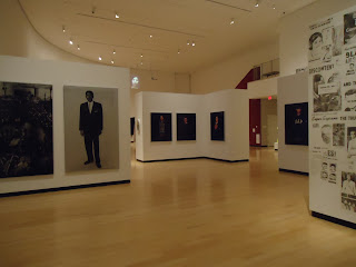
of the exhibition that I visited at the Burchfield Penney Art Center was McCallum Tarry: Intersections. The works in this exhibit were created by a
husband and wife team named Bradley McCallum and Jacqueline Tarry. The theme of
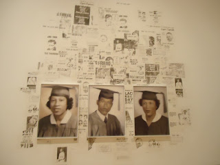
this exhibition is a mixture of a few different subjects. The Civil Rights movement of the United
States, homeless youths in America, mothers with their children, and public use
of public space are all included in this mixture. The exhibit is bathed in a warm, yet bright
light. All of the light in this space comes
from natural light coming in through high windows, and light fixtures planted
in the ceiling. The exhibit is rather
large, so there were several different colors used on the walls. Stark white, deep crimson, and wallpaper were
used. The wallpaper was composed of hues
of silver, gold, crimson velvet, and peach.
The
gallery itself has many different nooks and crannies. However, the space, in general, is fairly
circular in shape and one may walk through each room /exhibit of the gallery by
following that circular pattern. There
is also a second gallery space on the second floor of the gallery that may be
accessed by stairs found in the main gallery space. The architecture of the gallery space is very
interesting. There are many free-standing
blocks of walls that are used to house the artworks, along with the normal
walls that frame the space.
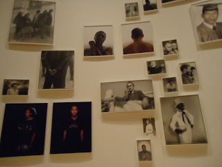
The artworks of the McCallum Tarry exhibition are organized in groups, as
the exhibition is broken up into mini-exhibitions. The pictures and paintings are clustered,
some in triangular shapes, some rectangular.
They seem to be grouped by meaning, such as portraits of civil rights
activists, images from the civil rights movement, images of the homeless, etc. Many of the artworks are similar, as they are behind
a silk-screen to create a blurry sort of view.
Also, many are in black and white, or are portraits of famous or
everyday people. Some of the
artworks are oil on canvas, some are photographs on canvas, some are portraits,
some are plaques, and some are video documentations. Some of the
artworks do not have frames. Others have
a mixture of oval, square, and rectangular shapes. Some look rustic and beaten up while others
look brand new. Most of the artworks
themselves are located a few inches from each other. However, the varying mini-exhibitions within
the exhibition are separated by walls, or by a few yards. The labeling of the exhibit was somewhat
confusing. There was only one label for
a series of paintings or portraits, and it was difficult to find where one
mini-exhibit left off and another began.
I would have much preferred each mini-exhibit within the exhibit to be
clearly designated and marked.
Art Criticism:
Image One:
Describe: The
image we see here is one of a funeral.
It is not just any funeral, but a funeral for a KKK member. The casket is covered in flowers, and
surrounded on both sides by individuals in traditional KKK garb (whit hooded
cloaks). Five unmasked individuals
acting as pallbearers, a young man in a tuxedo, and a priest walk toward the
viewer.
Analyze: This image is balanced symmetrically, as
the focal point of the casket and priest are surrounded on either side by
members of the KKK. Shape can be found
in the forms of the people present, the flowers, casket, and mausoleum. Space can be seen between the living and the
deceased; the priest and young man, and the casket and pallbearers. Repetition can be seen in the numerous
cloaked figures and an emphasis is placed on those not cloaked.
Bracket: Religious iconography can be seen in this
picture with the priest’s robes and bible.
Interpret:
There are two different ways in which a viewer might interpret this work
of art. When viewed in context, looking
at the theme of the exhibit as a whole, the viewer may believe that it was
created to showcase the terrors and horrors associated with the fight for Civil
Rights. Specifically, the KKK and the atrocities
they committed against African-Americans and their supporters. Placed with the other artworks, collectively,
we view this piece as part of a greater whole, a piece of the history and
events of the time. Singly, if this
picture were viewed alone, one may wonder, as I did, at the humanity of the
work. How could a group so inhumane
attend a service that is such an integral part of humanity; and with a priest,
no less! This viewer may believe that
the artist was attempting to convey that even though the KKK committed atrocities,
they are still human beings who hold their own beliefs.
Image Two:
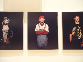
Describe: The images we see here are of 3 homeless
youths from Seattle. The first youth is
female and has a Gothic/punk style of clothing, makeup, and piercings. She stands with her hands in the pockets of
her hoodie. The second youth is dressed
in a turtle neck, long sleeve shirt, overalls, red bandanna and has gauges in
his ears. He stands in a defensive
posture, arms crossed across his chest.
The third youth is dressed in black pants, a Bob Marley tee-shirt,
necklace, and watch. He stands in a
relaxed pose, one hand in his pocket and one on his side.
Analyze: Emphasis is the main principle found in
this work of art. In each photograph, a
person stands alone in a background of darkness; there is nothing to take away
from the image of that individual. Color
and light are also elements that can be seen in these photographs. The individuals are bathed in light (a
contrast with the black background) and their clothes, hair, and skin tones
present various different colors in the work.
Form can be seen in the individuals’ bodies, as texture can be seen in
their hair, skin, and clothes.
Bracket: Iconography can be found in the image of
musician Bob Marley, the red bandana that suggests gang relations, and the
symbol for anarchy and the all-seeing-eye on the girl’s tee-shirt.
Interpret: Endurance,
the name of this mini-exhibit features 26 homeless youths who have lost someone
close to them from living on the streets.
The individuals were photographed, gave an audio testimony, and stood
still in front of a video camera for an hour each. I believe that these individuals were
photographed in a shadowy, dark background to show the oppression that they
face, and the impending trials they will face with a life on the streets. However, I believe that each were photographed
singly, with nothing else behind them in the picture, to give them a voice and
a presence; to allow them to be invisible no longer.
Image Three:
Describe: The image we see here is one of
chaos. Police in riot gear shove through
a large group of civilians, gathered for some sort of protest. A fence separates the police from the
civilians, but is opened with police streaming into the crowd. A few bystanders take photographs of the
scene in front of them.
Analyze: In this work of art, line can be seen in
the form of the fence, the symbolic separation of good and evil. Form is also very prevalent in this work; it
can be found in the shapes of the people – their helmets and face shields
especially. Repetition and rhythm can be
seen in the masses of people and their suggested movement.
Bracket: Iconography can be found in the Police
officer’s badges and riot helmets, and the fence that separates the “good” from
the “bad” (whichever that is).
Interpret: This image was a part of a mini-exhibit
which showed the effects of the Civil Rights movement in Japan. I believe that this picture was meant to show
the audience that oppression can happen anywhere, and to all races. It was also used to show the chaotic element
of protest and the fight for civil rights.
Summary:
I enjoyed going to the art gallery to explore the space and layout and architecture rather than simply the artworks. It was interesting to look at the use of space and realize why things might be placed in a certain way, or why extra elements (such as extra walls) might have been added. Looking at the space as a whole opened my eyes to how artists, especially installation artists, may wish to utilize specific elements of the space in their works of art.


No comments:
Post a Comment